The Garden App - Case Study
Web Development Project
Timeline: 12 weeks
My Role: Need-Finding, User Research, Prototyping, HTML/CSS, and User Testing
Background
Within an Interaction Design course at UCSD, I was apart of a group of three students who were required to develop an interactive mobile app. The app my group developed and designed is called The Garden App. This project was based on my experience in the UCSD Transfer Community Garden. As a student with limited experience in vegetable and fruit gardens, I found it difficult trying to find the information I needed for the garden to strive in the schools specific environment. With the help of the UCSD Grow Association, other campus community gardens, and the advisor responsible for helping to care for the community gardens, I was able to learn most of the information I needed for our club to keep our garden thriving. But without all those community and campus resources, I knew that learning and researching all the information that was necessary to keep our garden thriving would have been an overwhelming task. This is what encouraged me to develop The Garden App as a team project.
This app was created with the intention of helping novice gardeners find the information they need for their plants to grow healthy, as well as help gardeners to more easily navigate the intimidating world of at home or community gardening. The app allows users to search and discover plants that would thrive in their environment, give individuals the "Dos and Don'ts" about their newly added plant, and they have the option to customize a weekly calendar for each plant added to their profile.
Problem Statement: Without the guidance of a local gardening community or extensive online research, it's difficult and time consuming to find the resources and knowledge a novice gardener needs in order to care for their garden in their local environment.
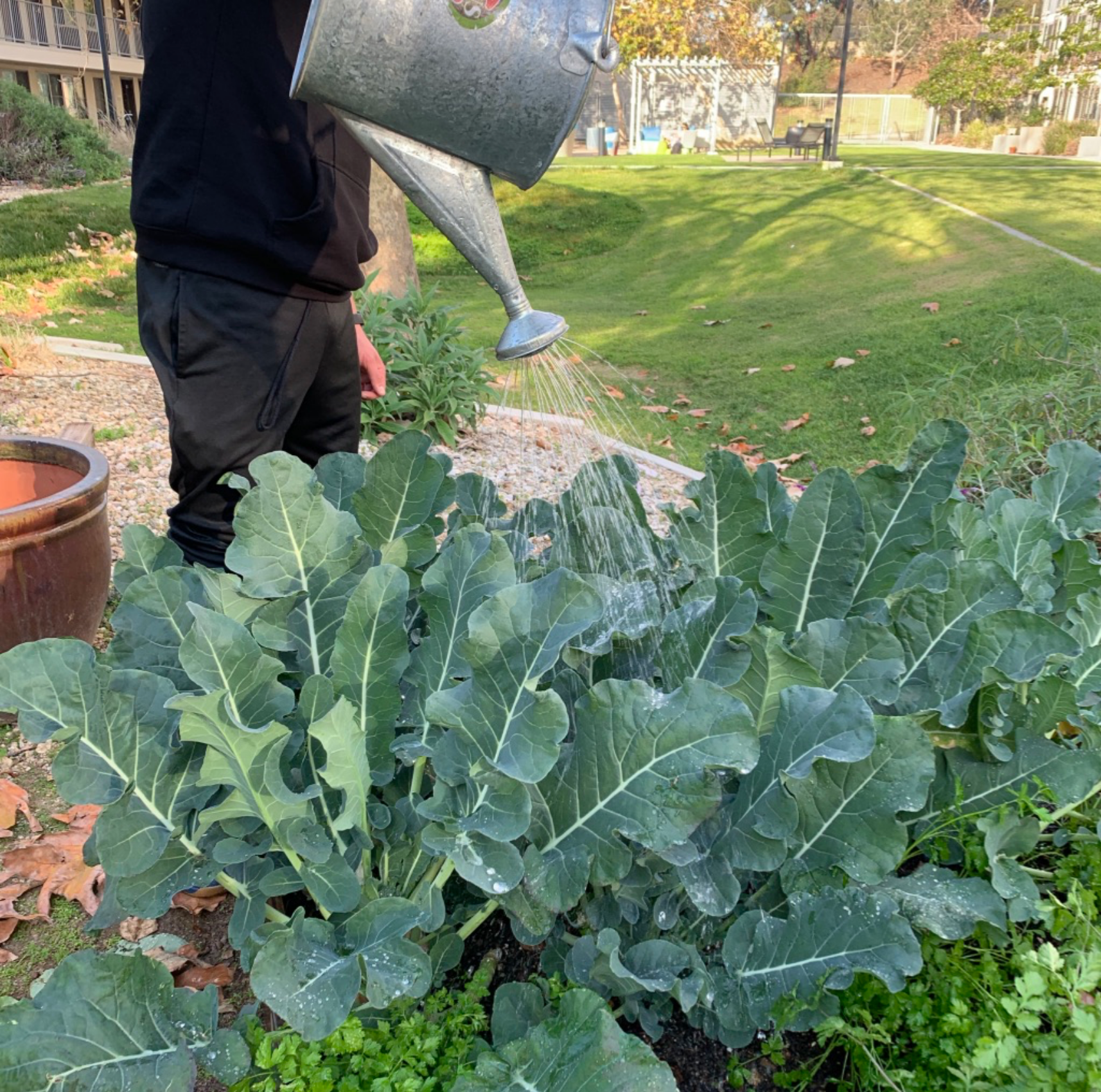
My Co-President, Cristian, watering the Broccoli plants at the Torrey Pines Vegitable Garden.
Need-Finding & Research
While in search of a possible need that could be fulfilled, I chose to observe my fellow garden club members at the Torrey Pines Edible Garden (TPEG). During these observations, we discussed several different issues and questions that come to mind as novice vegetable gardeners. We realized we'd have to continously look up facts about several different plants in the garden, such as how far each plant should be from one another or how much sunlight does this plant need to grow properly. We were able to find all the information we needed through our connections with campus garden advisors and other more established on-campus garden organizations. The possibility of creating a mobile application that could bring all the information novice gardeners would need and the ability to bring them in connection with other local, more established, gardens would be very helpful.
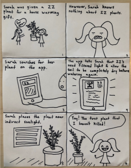
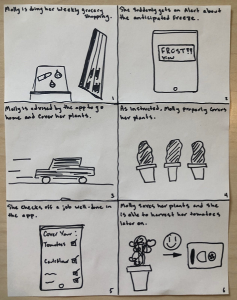
Storyboarding
Our goal in drawing storyboards were to see how everyday users would interact with our app. We had hopes that our interactive app would help individuals to know when and how they should care for their garden, which would enable a more enjoyable gardening experience.
Prototyping
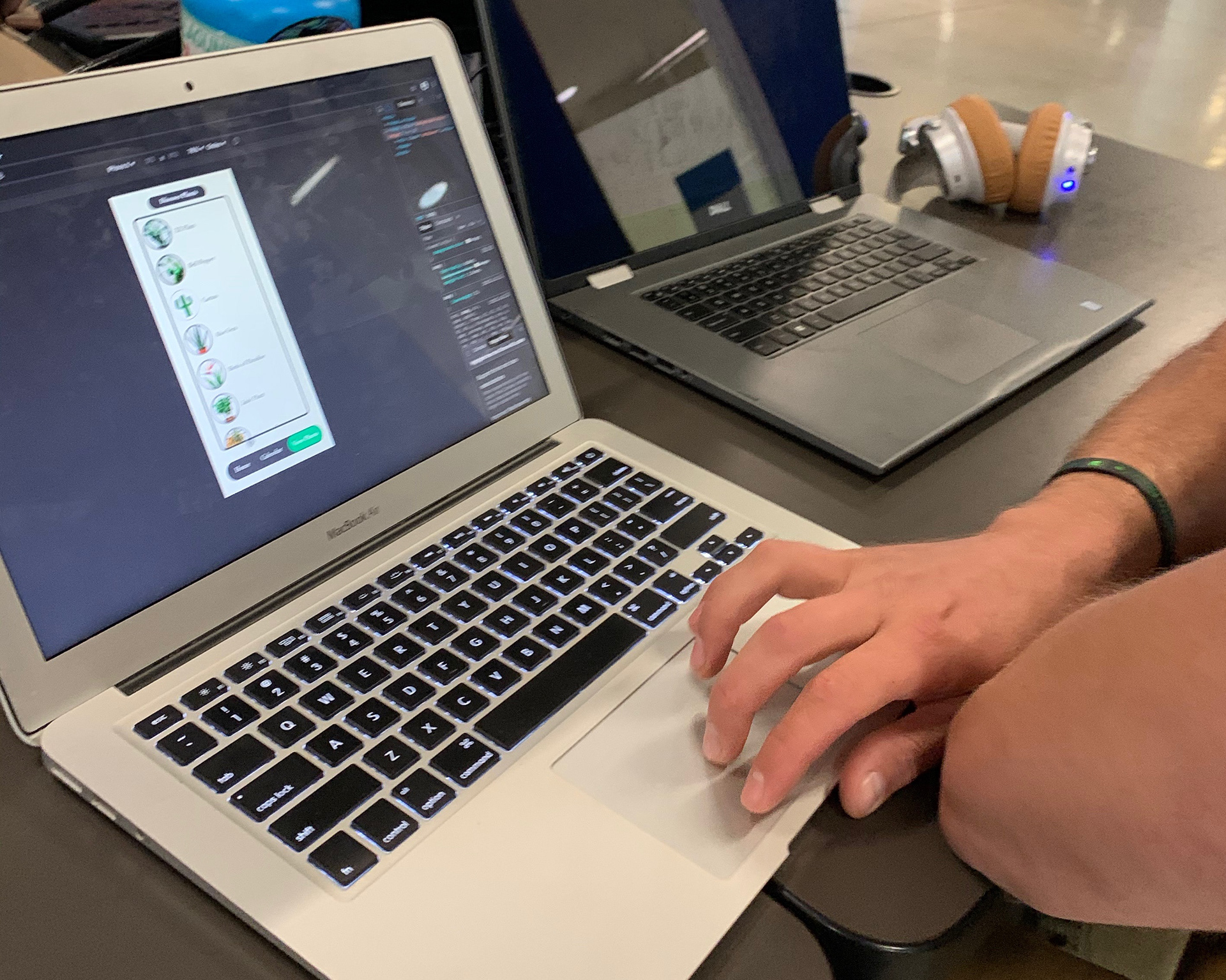
Paper prototypes helped us to envision the look and feel of our mobile app. With only one person in our team having experience designing a high-fidelity interface, this was a very new experience for the other 3 of us. The main goal we wanted to achieve was to create a simplistic and clear cut interface. Outside of this course, I would create a series of questions for the user in order to tailor the app's features to that specific person. Due to the fact that within our courses time constraints and requirements, we weren't able to add in every interaction we wanted, but we were able to hit some of the main interactions of the app.
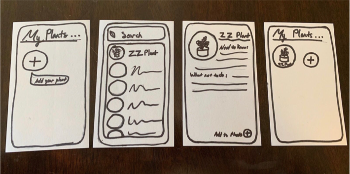

Our paper prototype includes the user's ability to add a plant to their profile, search or discover plants the user my be interested in adding to their profile, and also view the plant's profile. The plant profile would include all the information the user would need to start a comfortable and knowledgable gardening journey. The second paper prototype included an option where the user would be able to view harvesting dates and compare the development of their plants to the information we have logged within the calendar.
Design Testing
Using Neilson's Design Heuristics, we asked 3 individuals to test our paper prototypes. Our team asked the user a series of questions, based on the design heuristic, and we got a number of feedback and suggestions we were able to incoporate into our Wireframe and digital prototype. There were a number of ideas derived from this experience, but did not have the extra time or resources that bring those ideas to life.
With our heuristics evaluation helping us to add in the user necessities, we were left feeling unsure about one of our design choices. The navigation bar was an important part of the design and usability that most users did not have an issue navigating with. But, we were not sure if it would be simpler and even easier for the user to toggle between interfaces with a centered, static navigation bar or a left pull out type navigation. In order to truly know which navigation allowed the user the quickest and easiest ability to toggle between interfaces, we chose to conduct A/B testing with more than 2 dozen participants. We attempted to track the amount of time it took for our participants to complete a task, which was to add a plant to their Plant Calendar watering schedule. With the use of google analytics and in person trials, we tracked the total amount of time it took for the participant to maneuver between the interfaces, with 10 individuals using Version A and 10 using Version B.
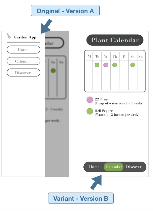
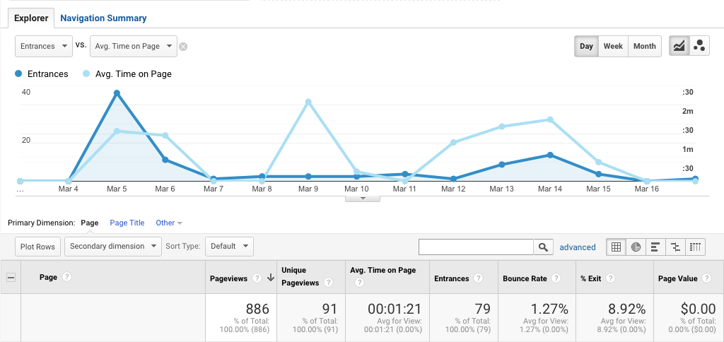
Our Test Results
We found that participants using the "Version A" interface had to tap or click twice as much as the participants using "Version B" from our in person timed trails. We observed individuals using "Version A" also took longer to complete our given task of adding a plant to their Plant Calendar. Though we connected our separate page versions to Google Analytics to get more detailed and precise information, time constraints and our unfamiliarity with the system resulted in test information that was not much help. With the data we observed from in person testing, we knew the right choice was to change our Original design to "Version B", allowing the navigation bar to remain on the page so that users can easily toggle between different interfaces.
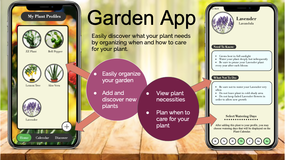
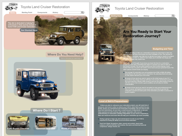
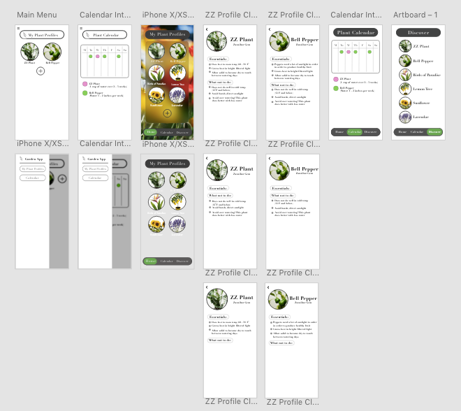
Final Design
The poster-board above reflects 2 of the main pages depicted in the final design of our project. With this being the first web development application I've ever created, I am very proud of the part I played in how our app came together. Though the styling of the app is not as high-fidelity as it could be, the steep learning curve that came with never having coded in HTML/CSS allowed me to learn an incredible amount of information.
If I had the time and money.... I would have added a weather feature where the watering calendar could notify users as to when they would need to cover their plants due to a frosty morning or be notified of any other major weather changes. I would also add a feature where the users would be connected and notified of other local gardens in their community and that local gardeners tips and tricks could be view through their own profile. In addition, I would have added an option where the user was notified, not just available in the "Need to know" tab, when to harvest their vegetables or fruits. I believe also it may have been helpful for the app to recommend tools or resources for each plant and show the user a local nursery or store where they could buy the resources and tools they need.